
In the digital age, the importance of website colors cannot be overstated. Your choice of colors directly influences how users perceive your brand and interact with your product. Color psychology is paramount in shaping emotions, attitudes, and behaviors online, underscoring the need for businesses to meticulously select their color palette when establishing an online presence
Understanding Color Psychology
Color psychology is the study of how colors affect human behaviour and emotions. Different colors evoke various psychological responses, making them powerful tools for shaping perceptions and influencing decision-making.
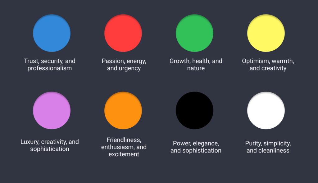
Blue - trust and security
Symbolizing trust, security, and professionalism, blue is a popular choice for corporate websites and apps. It instills a sense of reliability and credibility, making it ideal for financial institutions, technology companies, and healthcare providers.
Example: IBM’s website utilizes various shades of blue to convey professionalism, trustworthiness, and reliability. The color scheme reflects the company’s commitment to innovation and technological expertise
Red - passion and energy
Often associated with passion, energy, and urgency, red can evoke strong emotions and stimulate action. Businesses commonly use it in calls-to-action buttons to prompt users to make a purchase or take the desired action.
Example: Netflix incorporates red prominently throughout its website, particularly in its call-to-action buttons, to create a sense of urgency and excitement. The vibrant red color encourages users to subscribe and engage with the streaming platform
Green - health and nature
Representing growth, health, and nature, green is often used by brands promoting sustainability, wellness, and eco-friendly products. It can also signify wealth and prosperity, making it suitable for finance and investment-related websites.
Example: Whole Foods Market’s website features a predominantly green color scheme, reflecting its focus on sustainability, health, and natural products. The use of green reinforces the brand’s commitment to environmental consciousness and wellness.
Yellow - warmth and creativity
Known for its optimism, warmth, and creativity, yellow can grab attention and convey a sense of happiness and positivity. However, it’s essential to use yellow sparingly as it can be overwhelming in large doses.
Example: McDonald’s website incorporates touches of yellow to evoke feelings of happiness, positivity, and energy. The cheerful yellow accents complement the brand’s vibrant and dynamic image, enticing visitors to explore their offerings.
Purple - luxury and sophistication
Brands targeting a more upscale audience often use purple, associating it with luxury, creativity, and sophistication. It can convey a sense of exclusivity and elegance, making it suitable for beauty, fashion, and luxury goods.
Example: Milka’s website incorporates shades of purple to convey luxury, sophistication, and exclusivity. These emotions align well with the experience of enjoying chocolate. By using purple, Milka can evoke these emotions and create a sense of premium quality associated with its products.
Orange - enthusiasm and excitement
Combining the energy of red and the optimism of yellow, orange exudes friendliness, enthusiasm, and excitement. It’s commonly used by brands seeking to create a sense of fun and approachability.
Example: Mastercard’s website features a bold orange color palette, reflecting its brand personality of friendliness, enthusiasm, and approachability. The use of orange creates a visually stimulating and engaging user experience.
Black - elegance and power
Symbolizing power, elegance, and sophistication, black is a versatile color often used to create a sense of luxury and exclusivity. It can also evoke a feeling of mystery and intrigue when used sparingly.
Example: Chanel’s website utilizes black extensively to evoke a sense of elegance, sophistication, and luxury. The sleek black background and minimalist design reflect the brand’s timeless and iconic image.
White - purity and simplicity
White represents purity, simplicity, and cleanliness, and designers commonly use it to create a sense of spaciousness and clarity. Its association with simplicity and minimalism makes it a popular choice for modern and sleek designs.
Example: Apple’s website embraces a clean, minimalist design with a predominantly white color scheme. The use of white creates a sense of simplicity, clarity, and modernity, reinforcing the brand’s commitment to sleek and intuitive technology
Conclusion
By understanding the psychological impact of colors, businesses can strategically choose hues that align with their brand identity and evoke the desired emotional response from their target audience. Whether you’re designing a website, app, or digital marketing materials, selecting the right colors can make a significant difference in attracting users, building trust, and ultimately driving conversions. So next time you embark on your digital journey, remember the importance of the colors and their ability to shape perceptions and influence user behaviour on your website.
Leave a Reply